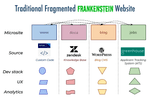
One of my previous jobs was with a hosted CMS startup. We sold an all-in-one solution — but, behind the scenes, our own site was a hodgepodge of different parts, each controlled by different software.
We used WordPress for our blog. Customer service software powered our docs. The careers section was controlled by HR and whatever platform they used. And our homepage was hand-rolled HTML that only our dev team could touch.
Our site was one truly scary mess of a frontend monolith. It was all stitched together like Frankenstein’s monster!

Do you work on a Frankenstein website, too? Is every section of the site under a subdomain? Does a logo click sometimes take you to the homepage, and other times to the landing page of a section? Does the color scheme of each section kinda, sorta, maybe match?
On a Frankenstein website some pages are fast and others are slow. Some are optimized for mobile, and others not so much. Some pages use Google Analytics, other pages use a different tracking script, and yet others use both — or neither (yikes!).

Orchestrating Chaos
The solution to a fragmented Frankenstein site? A unified content mesh website that pulls together multiple data sources and services — and orchestrates them with a single front end layer.
You can’t tell from browsing Gatsbyjs.com, but our site is powered by two CMS’s and two databases, with our codebase managed in two mono repos. Instead of erecting endless subdomains, each data source simply feeds a different subdirectory. This means users (and search engine spiders) have a pleasant experience navigating from page to page, easily finding exactly what they need. Gatsbyjs.com is the opposite of a Frankenstein site. Our Gatsby-powered front-end smoothly orchestrates independent content systems, just like a healthy human body.
Gatsby started out with a site that used MDX files for our blog and documentation, and Airtable for events. As we grew, we added a second site for Gatsby Cloud that pulled content from Contentful and a Postgresql database. Then one day we realized, Wait, we’re Gatsby! We can merge both sites, and give users a smooth experience from a unified front end! So we combined the sites, and migrated our blog to WordPress.
Now, half of our unified site’s codebase is managed in a public mono-repo, and the other (Gatsby Cloud) half is in a private GitHub repo. Content is sourced from two CMS’s and two databases.
Why so many data sources? Well, we’ve given each team the exact system and setup they need to rapidly release new features and content. Our users get a seamless experience, and our internal teams enjoy independent deployment pipelines. A new blog article from Marketing doesn’t hold up a bug fix from the Gatsby Cloud engineers.

The power of a micro frontend
We are able to do this because Gatsby enables teams to work with micro frontend architecture.
Wait, micro what? Micro frontend architecture is “a design approach in which a frontend app is decomposed into individual, semi-independent ‘microapps’ working loosely together.” Basically, snapping together different modular parts to build your full site or app, just like so many Legos.
When I first joined Gatsby I understood this in theory, though I didn’t grok the benefits for my own work right away. Yeah, ok – Gatsby empowers a newfangled “micro frontend” architecture – sure. But it took a while to understand exactly what that meant for me in my everyday job.
My Eureka! moment came when I swapped Gatsby’s Google Analytics tags to Google Tag Manager. I thought the change was applied only to the public-facing pages of the site, and not to Gatsby Cloud’s private pages — remember, those were in a different repo, accessed through a different CMS. So I contacted my colleague and asked him for the greenlight to also add it to the app.
“It’s already there, Hashim. When you switched the tag, it applied to the entire site.”
I was genuinely stunned! I was used to struggling with a Frankenstein site, where a change to one site section required convincing, begging or even fighting with other teams to have it applied site wide.
I checked my Gatsby Cloud account, and my colleague was right. The change applied everywhere! In my old job, this improvement would have taken me days, if not weeks, of bugging colleagues to make my changes part of their own particular limb of our Frankenstein site anatomy. Now? Just one step.
Share your scariest site stories!
Have you worked on a terrible website, and lived to tell the tale? Contribute a tale of terror on Twitter, Instagram or LinkedIn and get a limited edition glow-in-the-dark Gatsby sticker! Tag your tweet or post #ScarySiteStory and share your story by Halloween, October 31st to get the spookiest Gatsby sticker ever 👻.